1 Fluent Design2 Building Unity
What’s interesting about Microsoft’s misses in mobile is the company has had some good ideas. Redmond also had huge ambition. Certainly, when Windows Phone arrived a decade ago, the company promised it would transform mobile. This was the platform, Microsoft said, that would be the design backbone for the industry. The eye-catching Metro tile-based user interface looked good and was functional. Delving deeper into the experience, Microsoft wanted apps to integrate with each other to allow content to be one across a device. Of course, we know that those aspirations for Windows Phone mostly fell apart. Still, Microsoft’s ambition to define the mobile user experience has never gone away. Perhaps now those ambitions are more focused on individual apps for the time being, but they’re there.
Fluent Design
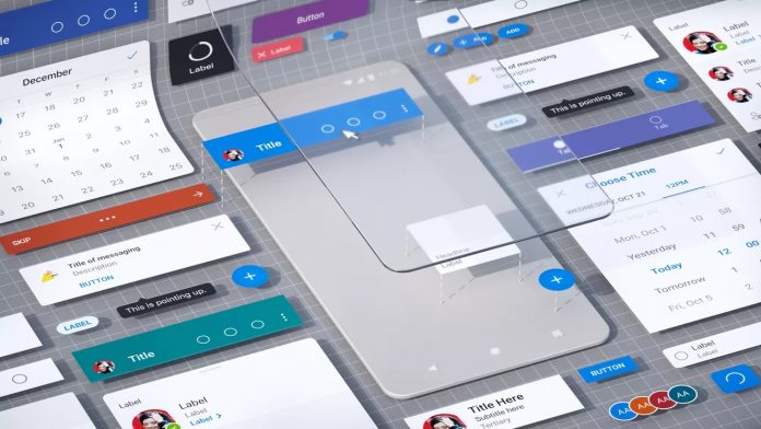
A hint of Microsoft’s plans to pave the way for a new mobile user experience can be seen in Fluent Design. Yes, this is the Windows 10 aesthetic that Microsoft has since rolled out to many of its services, whatever platform they may be on. For example, the company’s mobile Office apps display Fluent Design on Android and iOS. These apps, with Fluent Design underpinning the experience, are focused on simplifying use and to make productivity more efficient. In a piece with The Verge, the company discussed how Fluent Design is spearheading a new era where Microsoft can influence mobile UI design. “When we look at the mobile market, we feel like no one has done an amazing job of nailing productivity on phones across voice and visual systems in a sort of microtasking kind of way,” explains Jon Friedman, corporate vice president of design and research at Microsoft. “We feel like it’s our birth right and duty to help people in the world accomplish their goals, so that’s why we’ve been super focused on this.”
According to Friedman, Microsoft has researched how people use their phones across the globe. Gathering a 40-strong design team, he says the company is “rethinking” how mobile productivity should look and feel. “Not just the apps themselves, but how they all connect together and work together; and to build a common design system to extend Fluent to be a truly mobile-first design system.”
Building Unity
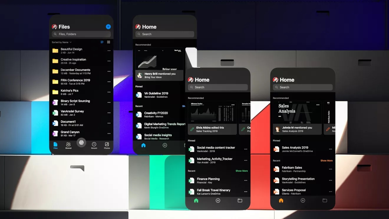
Uniformity is the core of the new experience, with apps such as OneDrive, Excel, Word, PowerPoint, Outlook all carrying the same design elements. Yammer, Teams, and Planner will all be aboard the ride soon. These are all tied to the Office suite, but Microsoft is likely to expand to other apps and service. “The thing we learned in all of our research is that people spend about 4 hours a day on their phone, but the average session time of doing something is between 20 and 30 seconds long,” explains.


