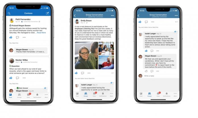
With this latest update, Microsoft is expanding on a recent major overhaul of the Yammer experience on mobile. As mentioned, a new conversation mode is available that includes new threading architecture. Microsoft says this allows interesting and important conversations to be highlighted more efficiently. Furthermore, Yammer has a new bubble UI that organizes conversation replies and a new “Read more” option. Microsoft says the new card-based design allows users to focus on the most important conversations. Indeed, Yammer has had a redesign in its content feed, including new icons, fonts, colors, and formatting.
Full Changelog
A new card-based design sharpens content in the feed and helps you focus on the discussions that matter most to you. This is combined with a refreshed icon set, additional fonts and typography, new color palettes, and smoothed out spacing & indentations that create a delightful interface and encourages effortless scanning and comprehension. Microsoft has rebuilt the threading architecture to highlight interesting and relevant conversations and moved some additional message details to keep the focus on the main card. A new bubble layout organizes replies for mobile allowing the user to read more as desired. Similarly, there is a “Read more” option in the feed to see additional conversations and expand threads. The new grid view for images and documents makes it easy to preview and engage with multiple images and/or files while scrolling. Link Previews captures image and text previews from almost any website. Additionally, links are now clickable directly from the feed cards so that you can get to the content you want to access faster. Videos in feed can now be played on the go with new inline video playback. Stream videos can also be played inline on iOS.
With this update, Yammer on iOS has bumped to v7.41.0 and on iOS is now on version 5.6.12. You can download the app from the App Store here and from Google Play here.


