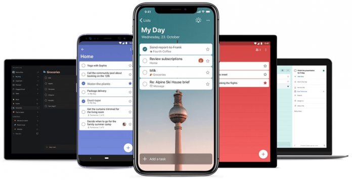
Leading the changes is the ability to toggle dark mode and see Microsoft To-Do with its dark theme. You may remember this feature was previously part of the experience but was removed. Microsoft has now brought it back. Elsewhere in Version 2.2, Microsoft To-Do users have the ability to drag a URL onto a task on the iPad. This can be done from any other app taking advantage of iPadOS 13’s Multiple Windows feature. Last week, Microsoft became an early adopter of Multiple Windows by integrating it with OneDrive. An update for the OneDrive for iOS applications allows users to see multiple files from the storage service, with files also editable. Furthermore, URLs can be dragged into a task list and create a note from the task. Finally, across iOS 13 and iPadOS 12, users can now see a preview card for URLs and also watch videos within the To-Do app. If you are interested in the newest version of Microsoft To-Do, it is available for the App Store here.
To-Do Redesign
Last month, Microsoft overhauled the To-Do experience across platforms, including on iOS. Microsoft described the new design as one of the final steps to integrating Wunderlist entirely into the To-Do experience. The road to migrating Wunderlist features to Microsoft To-Do has been a slow one. Microsoft acquired Wunderlist in 2015 for up to $200 million. Interestingly, To-Do’s new design came at the same time Wunderlist founder Christian Reber has offered to buy back the app.


